Digitizing a Peer-to-Peer Luxury Car Sharing Platform
Digitizing a Peer-to-Peer Luxury Car Sharing Platform
Digitizing a Peer-to-Peer Luxury Car Sharing Platform


Industry:
Industry:
Finance,
Finance,
Finance,
B2C
B2C
B2C
Year:
Year:
Finance,
Finance,
Finance,
B2C
B2C
B2C
Deliverables:
Deliverables:
Mobile App
Mobile App
Mobile App
Web app
Web app
Web app
Website
Website
Website
Go Live Project
Go Live Project
Next Project
Next Project
Impact on the company
Implementing a Minimal
Design System
Impact on the company
After launching the new tracking flow and updates, the redesign did more than make the app look better — it changed how 9jaDelivery operates and delivers value to customers:
This changed how we support users: By clarifying order statuses and providing the address-update component, customer support tickets related to order confusion dropped noticeably.
This changed how we prioritize product work: Tracking became a core feature for future updates, guiding decisions on which features to build next.
This changed how we communicate with customers: The simpler, clearer order updates allowed marketing to highlight reliability and transparency in pitches and campaigns.
This changed how we measure success: The redesign created new key metrics around order visibility and user engagement with the tracking screen, shaping the product roadmap.
This changed how leadership thinks about experience: The team now sees order tracking as a strategic lever, not just a UI element, influencing how features are planned and launched.
By redesigning this critical part of the customer journey, I didn’t just ship screens — I created a new foundation that improves user trust, reduces friction, and directly impacts business outcomes. This work now informs decisions across product, support, and marketing teams, setting a baseline for future growth.
Testing and Feedback
Implementing a Minimal
Design System
Testing and Feedback
Throughout the design and development process, I tested everything to make sure it actually improved the user experience. I used A/B tests for some parts, but I mostly relied on user interviews. Feedback from these sessions helped me see if the designs were working in terms of look, clarity of order updates, and how the information was organized.
Throughout the design and development process, I tested everything to make sure it actually improved the user experience. I used A/B tests for some parts, but I mostly relied on user interviews. Feedback from these sessions helped me see if the designs were working in terms of look, clarity of order updates, and how the information was organized.
Making the tracking experience easier and more reassuring
Implementing a Minimal
Design System
Making the tracking experience easier and more reassuring
Many users enjoy watching their delivery move on the map. It gives them a sense of progress, but I also noticed it can create anxiety. In busy cities, some people kept checking the map too often or even waited by their windows so they wouldn’t miss the rider when they arrived.
To improve this, I redesigned the map to make it clearer and easier to follow. I removed unnecessary details so the view feels lighter. I also added a predicted route, which helps users understand where the rider is going and what to expect next.
Enhanced order details
Implementing a Minimal
Design System
Enhanced order details
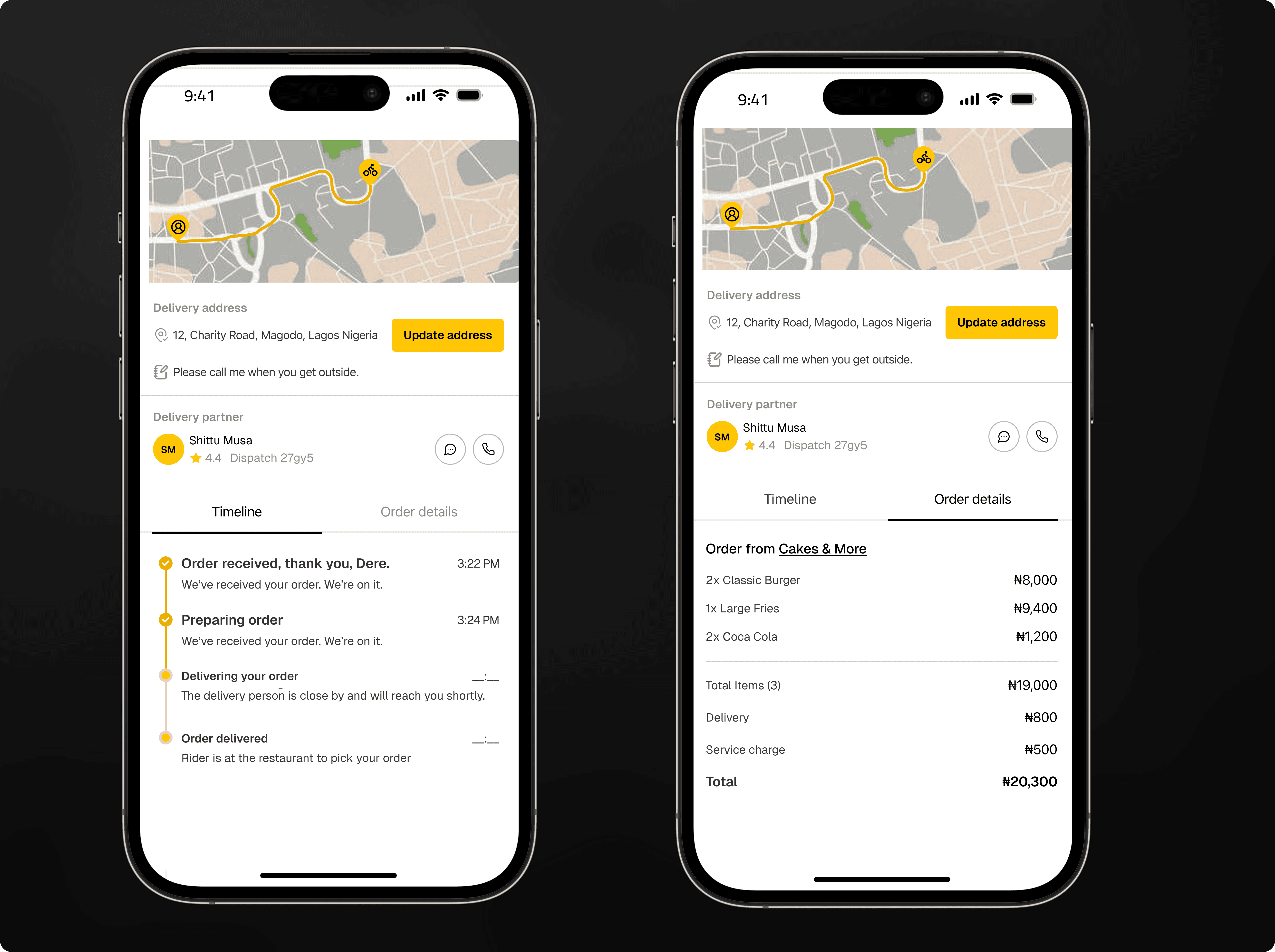
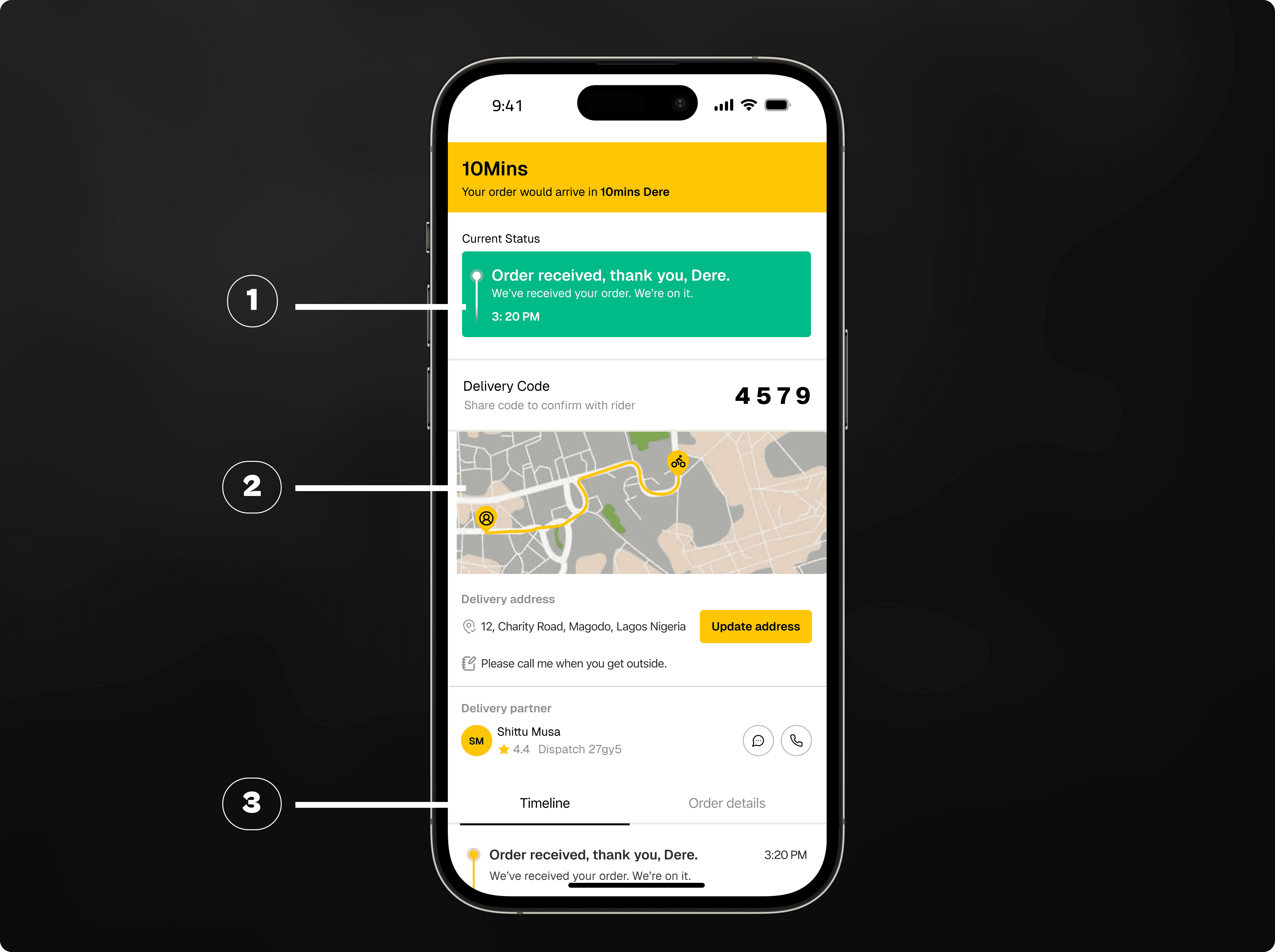
Further down the tracking screen, I improved how order details are shown. I simplified the main view to only show the key information, so the screen feels clean and easy to read. Most users just want a quick overview of their order, but some need more details. To solve this, I added a sub-tab where users can see all remaining order statuses and the full receipt. This way, users can get extra information when they need it without making the main screen feel crowded.
Further down the tracking screen, I improved how order details are shown. I simplified the main view to only show the key information, so the screen feels clean and easy to read. Most users just want a quick overview of their order, but some need more details. To solve this, I added a sub-tab where users can see all remaining order statuses and the full receipt. This way, users can get extra information when they need it without making the main screen feel crowded.

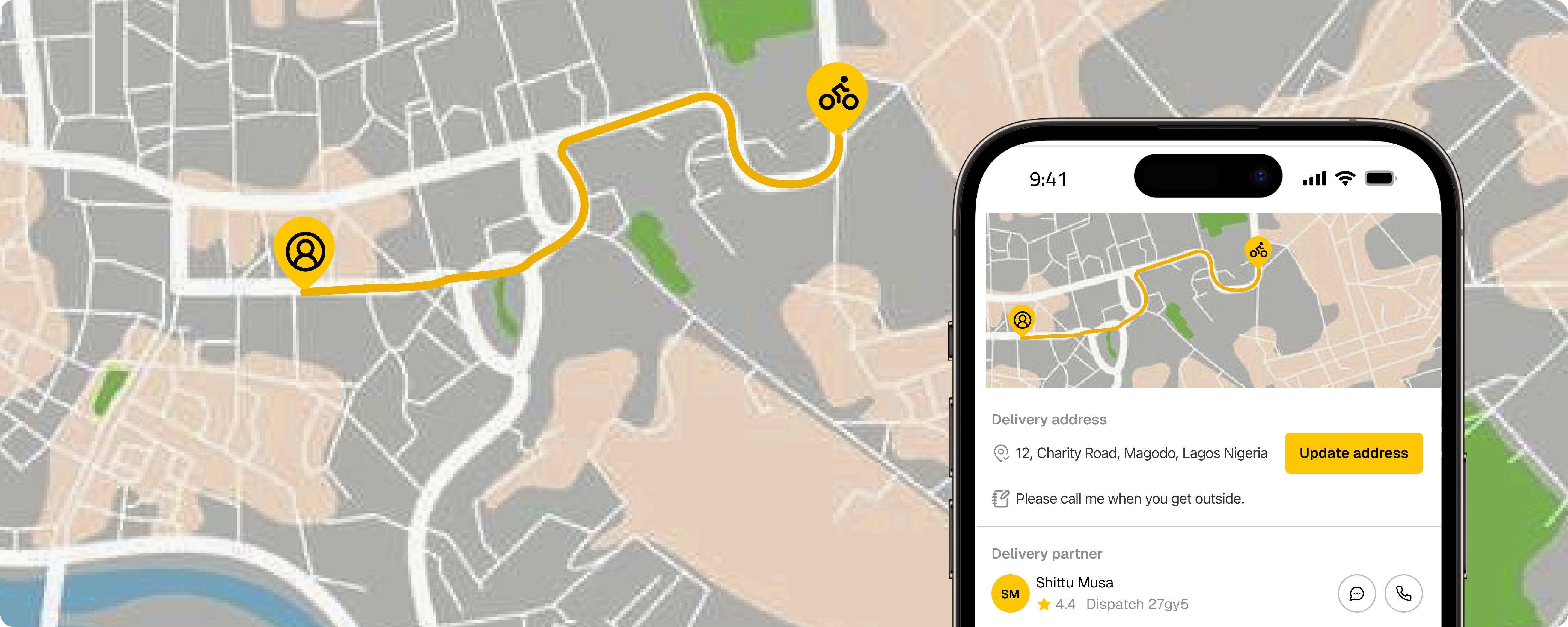
To help users handle important events, I designed a new component for the tracking screen. For example, if a user enters the wrong delivery address, they can use this component to update it. A small fee applies for the address change. It sits on the same screen as the estimated arrival time and order status but works independently, so users can focus on each element without confusion.
To help users handle important events, I designed a new component for the tracking screen. For example, if a user enters the wrong delivery address, they can use this component to update it. A small fee applies for the address change. It sits on the same screen as the estimated arrival time and order status but works independently, so users can focus on each element without confusion.
How I arranged the information
Implementing a Minimal
Design System
How I arranged the information
As a product designer, I am not only focused on making screens look good. I also need to make sure the information is arranged in a way that works well for users. During my research sessions, I noticed a clear pattern. After placing an order, most users check two things first: the estimated delivery time and the current status of their order. After that, many people drop their phone and continue with their day. They only come back once in a while to check again.
There is also a group of users who watch their order more closely. And when something unexpected happens, these users want all the important details to be easy to find.
Showing all this information on a small screen without making the interface feel heavy was a real challenge. To solve this, I arranged the tracking screen into three simple parts.
At the top, I placed the estimated arrival time and the current order status. These are the first things people care about, so they needed to be highly visible.
In the middle, I added a clean and simple map. This gives users a visual sense of where their rider is and makes the screen feel more alive without adding extra noise or unnecessary details.
At the bottom, within easy reach of the thumb, I added all remaining information such as rider details, support actions, or extra notes.

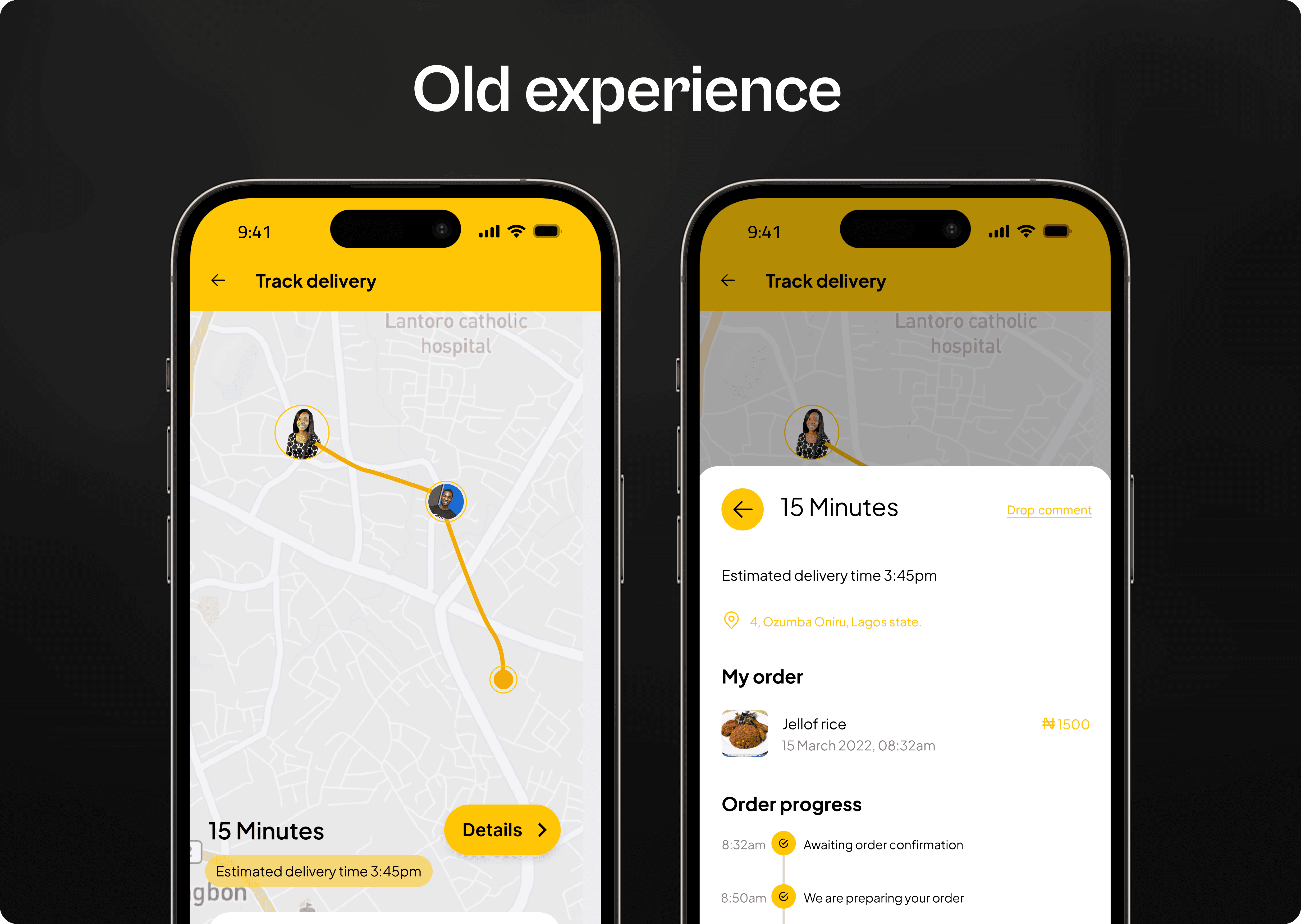
When I started working on the new tracking flow, one of my main tasks was improving the order statuses. I needed to find the right balance. I wanted to give users enough information so they feel confident, but not confuse them with too many updates. After several rounds of design and testing, I created a simple core flow that every order would follow. This meant removing some old statuses and moving extra details into smaller sub-steps.
One example was the old “Awaiting confirmation” status. I discovered that this step made many users feel unsure. Since most orders get confirmed anyway, I removed this as a main status. If an order is ever delayed or not confirmed, it is better to notify the user directly instead of making everyone wait in uncertainty.
Another example was how we communicated rider assignment. Instead of showing many small updates about finding a rider, I replaced them with a more familiar step, “Preparing your order”. This matched user expectations and made the flow easier to understand.
Even though these changes looked small, I knew they could affect thousands of users once released. So I tested every adjustment. I studied how it affected user behaviour, including how often people contacted support. A/B tests helped me understand the impact clearly, and the results gave me confidence to roll out the new order statuses to everyone.

Order statuses
Implementing a Minimal
Design System
Order statuses
At the heart of the tracking screen are two key things: the estimated arrival time and the order updates. I learned that users already have a mental picture in their minds of how they think their order should move. This mental model comes from their past deliveries, what they expect, and their experience with other apps.
When I asked users to explain the steps they believed their delivery goes through, the answers were always different. One reason for this is the way our old system displayed updates.
For example, we showed very detailed updates. Most of these updates focused on riders, and sometimes we displayed more information than users actually needed.
we showed very detailed updates.
Rethinking the tracking flow
Insight gathered from
the interview
Rethinking the tracking flow
As the only designer working on the After Order experience, my goal was to create more trust, transparency, and reassurance for users after they place an order. I already had a clear direction from past research and earlier design work, so I used that as my starting point.
As the only designer working on the After Order experience, my goal was to create more trust, transparency, and reassurance for users after they place an order. I already had a clear direction from past research and earlier design work, so I used that as my starting point.
As the only designer working on the After Order experience, my goal was to create more trust, transparency, and reassurance for users after they place an order. I already had a clear direction from past research and earlier design work, so I used that as my starting point.
The problems I wanted to fix
How I got the work done
- My Approach
The problems I wanted to fix
To understand the real issues, I began by studying how users interacted with the old tracking screen
The old tracking screen had become too limited. 9jaDelivery now handles more than simple parcel delivery. People send documents, food, personal items, and even small electronics. This created new behaviours, and the old tracker was no longer strong enough to support all of them.
I believe ordering something should feel simple, clear, and reliable. I wanted the tracking experience to feel more supportive, so users always know what is happening and feel calm throughout the process.
I noticed many users did not fully understand what was happening during their delivery. A lot of this confusion came from the order statuses we showed. These statuses changed depending on the order type, rider updates, and other factors. I wanted to make the information more consistent, clearer, and reliable across all order types.
In early 2024, I started a full review of the 9jaDelivery app. My goal was to improve the user experience and prepare the product for the next version of our platform. The tracking screen was one of the most important parts of this work. Through user research, testing, and expert reviews, I found several areas that needed improvement.
This case study explains the key steps I took and some of the challenges I faced along the way.
Project build up
Let me introduce GTI Ride
to you and how we connected
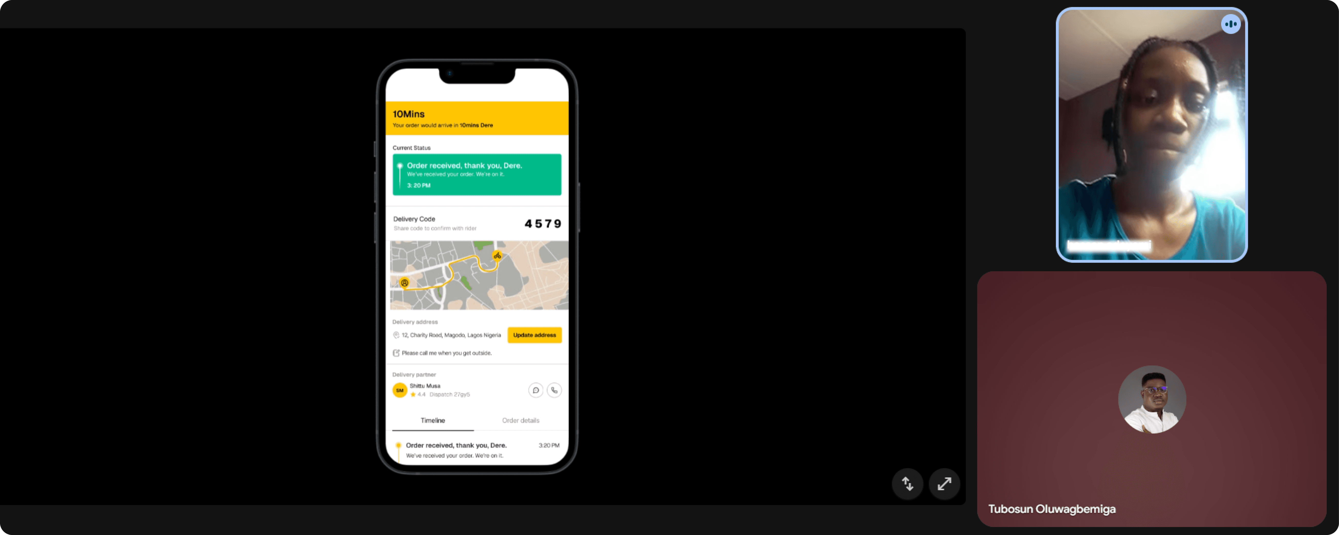
Every day, people use 9jaDelivery to send or receive items. They open the app, place their order, make payment, and land on the tracking screen, the place where they check what is happening with their delivery.
On the surface, the process looks simple. But in the background, a lot is happening. The sender confirms the order. Our system looks for an available rider. The rider then moves across the city, through traffic, bad roads, or even rain, to pick up and deliver the item.
Because of this, many things can affect how fast an order moves. Sometimes riders are few. Sometimes pickup locations are busy. Traffic in Lagos Island is not the same as traffic in Lekki or Ajah. And from our observations, users behave differently too. Some people watch the tracking screen closely, while others only check it once in a while.
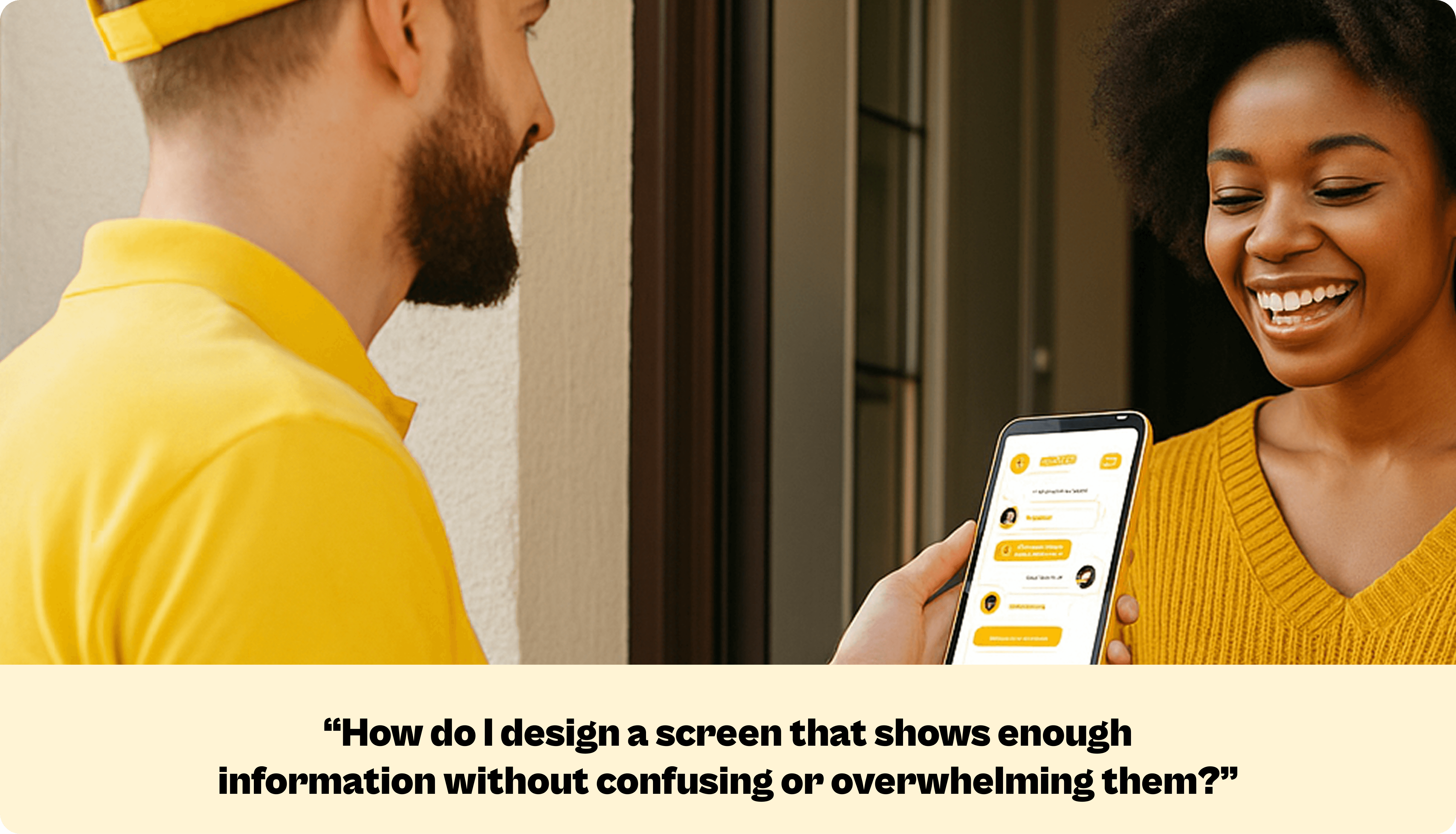
With all these moving parts, the tracking screen becomes the main place users depend on for updates. But the big question is: what updates do users really need at each moment?
And how do we design a screen that shows enough information without confusing or overwhelming them?
Every day, people use 9jaDelivery to send or receive items. They open the app, place their order, make payment, and land on the tracking screen, the place where they check what is happening with their delivery.
On the surface, the process looks simple. But in the background, a lot is happening. The sender confirms the order. Our system looks for an available rider. The rider then moves across the city, through traffic, bad roads, or even rain, to pick up and deliver the item.
Because of this, many things can affect how fast an order moves. Sometimes riders are few. Sometimes pickup locations are busy. Traffic in Lagos Island is not the same as traffic in Lekki or Ajah. And from our observations, users behave differently too. Some people watch the tracking screen closely, while others only check it once in a while.
With all these moving parts, the tracking screen becomes the main place users depend on for updates. But the big question is: what updates do users really need at each moment?
And how do we design a screen that shows enough information without confusing or overwhelming them?
Got an Idea?
Got an Idea?
Got an Idea?
Got an Idea?
Share with me
Share with me
Share with me
Share with me
Say Hello
Ready for a design adventure, or need product design advice? Ping me for fun collaboration
Ready for a design adventure, or need product design advice? Ping me for fun collaboration
Ready for a design adventure, or need product design advice? Ping me for fun collaboration
Ready for a design adventure, or need product design advice? Ping me for fun collaboration